…or fear of repeating a word is very common in the media. It’s a journalistic compulsion that is detrimental to clear communication and understanding – but easy to avoid.
Consider a couple of examples (with my emphasis added).
From the Daily Mail (a popular UK newspaper):
The average 19-year-old man in the Netherlands today is 6ft tall (182.9cm), while the typical woman is 5ft 7in (169.3cm).
From the Guardian (a somewhat more highbrow UK newspaper):
[The Institute and Faculty of Actuaries] said it now expects men aged 65 to die at 86.9 years, down from its previous estimate of 87.4 years, while women who reach 65 are likely to die at 89.2 years, down from 89.7 years.
Each of these two extracts varies the wording used when talking about men and women. Between them, they employ four different words to describe a single concept, the arithmetic mean. I know from talking to journalism students that this variation is deliberate. They are taught to avoid repetition – the horror aequi principle. The aim behind varying the vocabulary is to maintain interest, even at the cost of obscuring the message.
In the Daily Mail story, we are clearly intended to interpret average and typical as meaning the same thing, and to accept that ‘the average man’ and ‘the typical woman’ exist. But that is problematic (as discussed in the last post on this blog).
Consider camels.

About 6% of the world’s camels are Bactrians (with two humps) and the rest are dromedaries (with one hump). So, does the average camel have 1.06 humps? Does the typical camel have 1.06 humps? I would say that ‘the average camel’ is a mythical beast, and that ‘the typical camel’ is an unhelpful concept. And, I suggest, the same is true for people.
Would it really make the Daily Mail story so much less interesting to rewrite it in a more statistically respectable manner, avoiding mythical beasts and unhelpful concepts? There are many ways of doing that, and here is one:
In the Netherlands today, 19-year-old men are 6ft tall (182.9cm) on average, while the average height for 19-year-old women is 5ft 7in (169.3 cm).
Clarifying the language allows us to focus on the message – and to notice something else odd about the way the averages are presented. The metric summaries are given to the nearest 0.1 cm, but the imperial summaries are given to the nearest inch. The misuse of units is another journalistic sin, but that is a topic for another time.
The Guardian story is far worse in its horror aequi – almost comically so.
Saying that men aged 65 are expected to die at 86.9 years conjures up an image of some sort of mass extinction of these now 65-year-old men when they reach the age of 86.9. The women, by contrast, are likely to die at the age of 89.2. Presumably they won’t all die at that age, but most of them will: or perhaps it will be the age at which their death rate peaks.
Of course, both those interpretations are nonsense: in each case the Actuaries are giving the average ages of death. To a statistician, the expectation and the (arithmetic) mean are essentially the same thing, but it seems unlikely that the Guardian journalist was being quite so technical.
Instead, we assume the language being used is much looser: ‘expected to die’ and ‘likely to die’ are intended to be synonymous, with horror aequi driving the change in terminology.
Once again it is easy enough to make the story statistically respectable. For example:
[The Institute and Faculty of Actuaries] said that men aged 65 now will live, on average, to an age of 86.9 years, down from its previous estimate of 87.4 years, while women now aged 65 will live on average to an age of 89.2 years, down from 89.7 years.
With the language no longer obscuring the message, we can now think about what the numbers reported actually represent. And there is quite a lot to think about.
The story is about averages, and averages imply variation. This is worth emphasising: we only talk in terms of averages when we need to summarize over existing variation. We don’t, in any serious context, talk about the average number of legs per dog, precisely because there is almost no variation.
In many cases, the average on its own is inadequate. It gives, at best, a partial picture and, at worst, it can be thoroughly misleading. In this particular case, the distribution of actual or predicted ages at death is vastly more informative than any single number, like an average, can possibly be.
Here is a graph representing predicted death rates for a cohort of 65-year-old men. (It isn’t the same data as used in the Guardian story, but it will do to explain the point.)
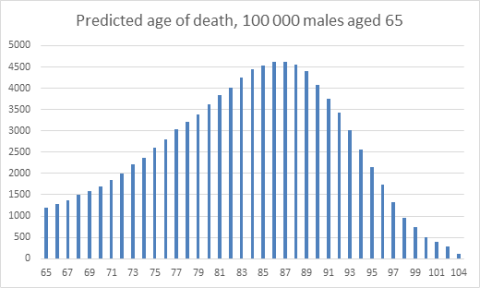
If I were a 65-year-old man, what would I want to know about my prospects?
- Perhaps the predicted average age at death for my cohort? That’s about 83 years for the distribution shown.
- Perhaps the predicted median age at death – the age by which 50% of my cohort will have died? That’s about 84 years.
- Perhaps the modal age at death, the age at which the death rate will peak for members of my cohort? That’s about 87 years.
- Perhaps a range of ages describing the middle 50% of the distribution? About 78 to 89.
Or, best of all, perhaps I would want to be given the graph, the whole distribution, together with those summary statistics – to interpret as I wish, knowing in reality I could fall anywhere in that distribution and there are many factors to consider that are not taken into account.
Using clear, consistent, and accurate language – no more horror aequi, please – allows us to think about what matters: the data and what information they really contain about the world around us.