Crisp morning air, a final round of barbeques, the closing of outdoor pools. Labor Day, the first Monday of September, unofficially signifies the end of summer in the US and officially celebrates the American worker. But what does this labor-centric holiday mean during a global pandemic?
I live in New York City, an area ravaged by COVID-19; March and April were filled with the endless lament of ambulances. While we are currently “enjoying” a precarious ceasefire, Dr. Anthony Fauci – America’s most famous doctor – warned that Labor Day celebrations could spark another wave of infections.
COVID-19’s tentacles have choked nearly every aspect of everyday life, including livelihoods. News articles about plunging unemployment rates abound, with dramatic graphs in tow. On the first Friday of each month, the US Bureau of Labor Statistics (BLS) publishes “The Employment Situation” containing a detailed summary of jobs gained and lost. The most recent set of numbers was released a few days before Labor Day. The headline number was that the August unemployment rate was 8.4%.
As Nobel Laureate Paul Krugman writes in his reaction to August’s jobs report, “…an economy’s success should be judged not by impersonal statistics, but by whether people’s lives are getting better.”
8.4% seems “impersonal,” to use Krugman’s words, not because it doesn’t represent real people, but because it’s usually reported in isolation, without context. (To be fair, Krugman doesn’t limit himself either; he finishes his column with many other useful—but gloomy—statistics.)
Aggregation by its very nature suppresses the individual for the group, but there is a middle ground between relying solely on a statistic or an illustrative anecdote. The question, then, is not which statistic to report, but rather which statistics to report.
Novelists tell us about weather conditions and rooms and historical events to enhance their character sketches. They describe their protagonist and place them them in context. Statisticians can do the same.
“Descriptive statistics” – such as means, standard deviations, and correlations – are our character sketches. We can enhance 8.4%, for instance, by adding a measure of sampling error; noting that we think the range 8.2% to 8.6% encapsulates the actual unemployment rate with 95% confidence.
But we need what I’ll call “contextual statistics” too. These go beyond the standard output of statistical software or the metrics spit out by algorithms. To illustrate this point, let’s look at four examples of contextual statistics:
- totals along with rates
- time series
- subgroups, and
- alternate definitions.
Totals, not just rates
The August 8.4% unemployment rate corresponds to a staggering 13,550,000 people without jobs who are searching for one. Simply writing out this magnitude gives us a better sense of just how enormous the problem is. Moreover, this tally is just a lower bound as many of the nearly 13.6 million people have families who depend on their earnings.
Tracking with time series
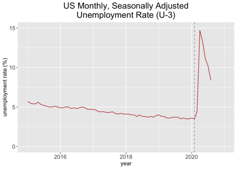
Converting a percentage into a total provides one type of magnitude, but it isn’t sufficient. Knowing that the unemployment rate is 8.4% is useful because BLS calculates the rate each month in the same way. That consistency lets us judge whether 8.4% is a large or a small number in relation to other months. Here is how the unemployment rate has fluctuated since 2015:

U-3 is the official unemployment rate in the US. The dotted line denotes February, 2020; lockdowns began in March. Source: Bureau of Labor Statistics.
It’s hard to miss the massive spike representing the last six months. As stores, restaurants, and gyms shut down and people were told to stay at home, unemployment rocketed. The pervasive suffering this has caused is well-documented: The media has reported on queues to cash unemployment checks, queues at food banks and still more queues to get nasal swab tests for coronavirus.
The graph above shows us that an 8.4% unemployment rate in August offers some good news because it has dropped from July’s rate of 10.2%. On the other hand, we’re not in the clear because in February before lockdown, the rate was 3.5%. Again, these useful comparisons are possible because unemployment is defined in the same way every month of every year.
Labor force subgroups
A third angle from which we can examine 8.4% is to see what types of people are counted as unemployed; that is, we can look at subgroups within the labor force.
The official unemployment rate which we saw graphed earlier is called U-3 by BLS – it defines the labor force as people who are employed (full- or part-time) or unemployed but have been looking for a job within the past four weeks. The unemployment rate is just the ratio of unemployed people to the labor force. (This statistic has recently taken a battering, due to a now-corrected issue with how interview responses were coded. As a source of non-sampling error, this coding irregularity was not factored into confidence interval calculations. The Brookings Institution has a good discussion about it.)
We know that employees have been laid off temporarily or permanently, furloughed, and so forth because of the pandemic. However, “unemployed” doesn’t only mean that a person has been laid off. For example, an unemployed person may be a newly minted graduate looking for her first job, someone reentering the job market after some time away, a person who just finished a temporary placement, or someone who recently left a job. (Remember all of these hypothetical people must have been searching for a job in the past four weeks to count as unemployed.) It is this last group—those who quit their jobs— that shows an unexpected pattern during the pandemic as shown below.

The number of people who are counted as unemployed in the U-3 statistic because they have quit their job (‘job leavers’). The monthly series is seasonally adjusted and the shaded areas represent recessionary periods. Sources: Bureau of Labor Statistics, National Bureau of Economic Research.
I’ve added shaded bands here to show the Great Recession, the longest recession in the US since 1948, and the recession the US is in the midst of right now, thanks to COVID-19. An interesting artifact in the above graph is that unlike during the Great Recession, the number of people voluntarily quitting their jobs has dropped precipitously, population size changes notwithstanding.
You might be willing to quit working temporarily to manage things in your personal life or if you are confident you can find a new job without being currently employed. We see some evidence here that people may be staying in jobs longer than they possibly would have otherwise because they see the COVID-19 havoc around them.
Alternate measures
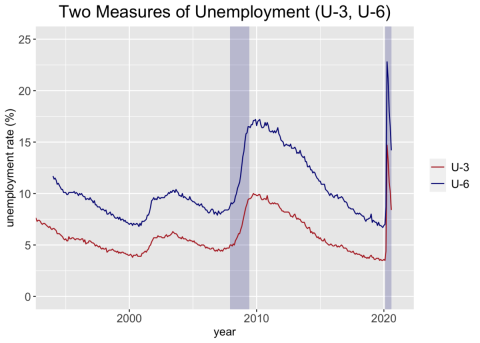
U-3 gets its cryptic name from the fact it is one of six different measures, U-1 through U-6, each of which define the labor force and employed persons in different ways. U-6 is more expansive than U-3; Those classified as unemployed in U-3 are still included in U-6, but so are (a) people who work part-time but want to work full-time, (b) those who aren’t actively looking for a job but want one, and (c) those who’ve given up altogether. The labor force in U-6 is comprised of all of these groups plus those who are employed full-time and those who are satisfied being employed part-time. To add more nuance to U-3 let’s add U-6 to our graph:

U-3 is the official unemployment rate in the US whereas U-6 includes more people both in the labor force and the definitions of unemployed and under-employed. Both monthly series are seasonally adjusted and the shaded areas represent recessionary periods. Sources: Bureau of Labor Statistics, National Bureau of Economic Research.
It shouldn’t be surprising that U-6 is higher than U-3; after all, more types of people are classified as unemployed or under-employed. The difference in magnitude, however, might be surprising. In August, 8.4% were unemployed based on U-3, but 14.2% had issues with employment if we use U-6. If that wasn’t bad enough, in April, the U-3 statistic was 14.7% and U-6 was 22.8%!
All else equal, U-3 decreases if people manage to get even a two-hour-per-week paying job or drop out of the workforce altogether. Neither is necessarily the desired outcome for a person, nor an economy. This doesn’t mean U-3 should be scrapped; rather, it shows why we need to augment it with alternate definitions, like U-6 to count people in different ways.
For international context, U-3 is useful because it is similar to statistics used in other countries and to the definition recommended by the International Labour Organization (ILO). While some of the specifics may vary (e.g., the US counts people 16 and older, whereas Japan starts at 15), the ILO uses statistical modeling to smooth out these differences so rates can be compared.
Historical context
Contextual statistics force us to think beyond abstract columns and rows of data and focus on the implications of our calculations. This brings me to another type of context, not the statistical kind but the historical.
Labor Day grew out of the efforts of labor movements across the US. It was first an official state holiday of New York (starting in 1882), and then became a federal holiday in 1894 by an act signed into law by President Grover Cleveland.
On the first nationwide Labor Day (September 3rd, 1894), The New York Times reported that 9,000 union workers, representing granite cutters, stone masons, marble polishers, iron molders, electrical workers, cigar makers, beer brewers and more, paraded through the streets of New York City. Another 400,000 people turned up to watch. And now, in 2020, New York queues for its future.


